Dynamic Identity development for the UK based Byron Hamburgers.
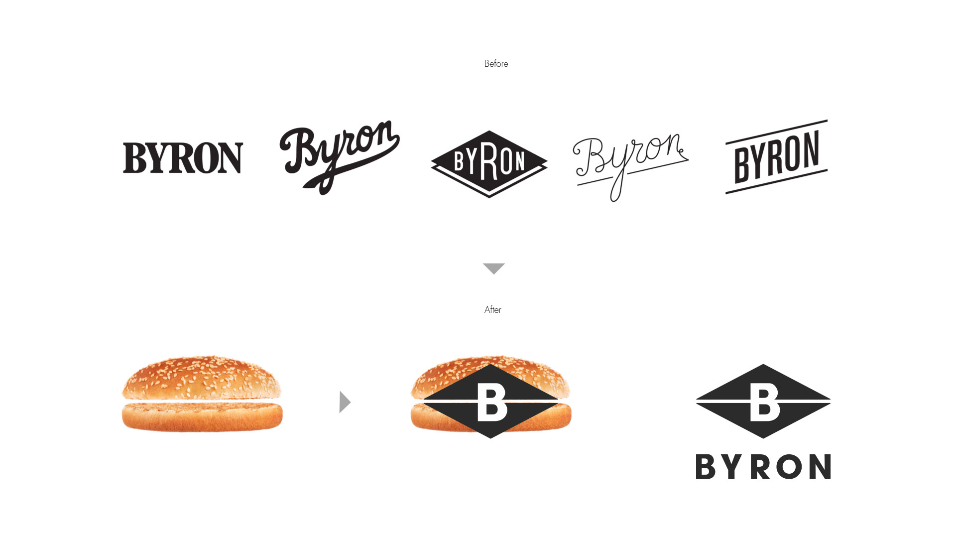
The Byron identity needed a rebranding. For many years, at least 5 different logos were used in the every day applications and none of these had anything in common.
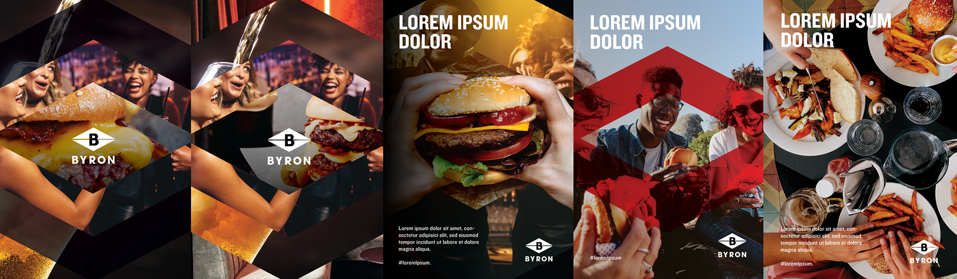
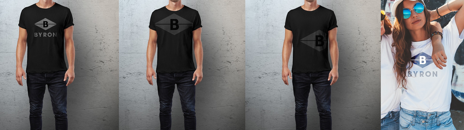
From the focus groups the one with the rhombus resulted as the most recognisable so the decision was to make it the primary logo made of 50% static elements and 50% dynamic elements.
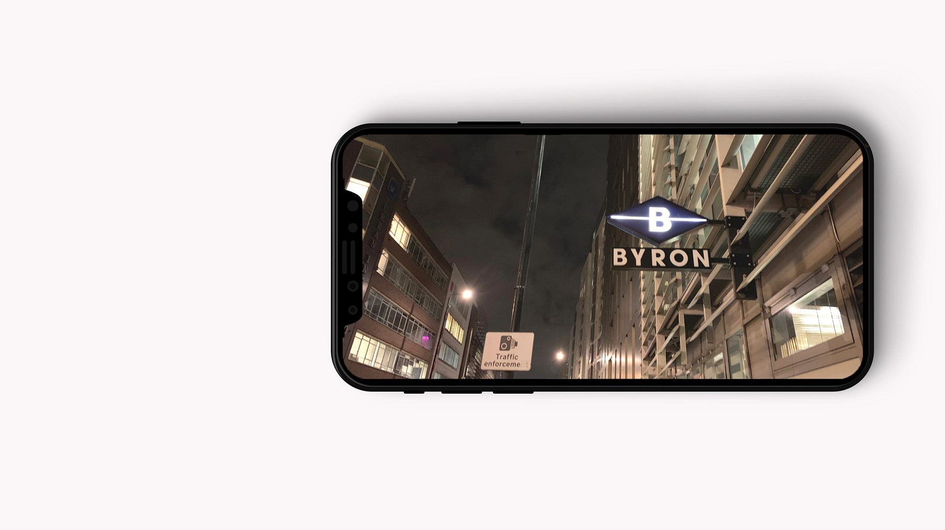
The rhombus with the B of Byron in it became a solid recognisable icon and, with the horizontal line, an abstract shape of a sandwich.
Agency: Kaizn Partners

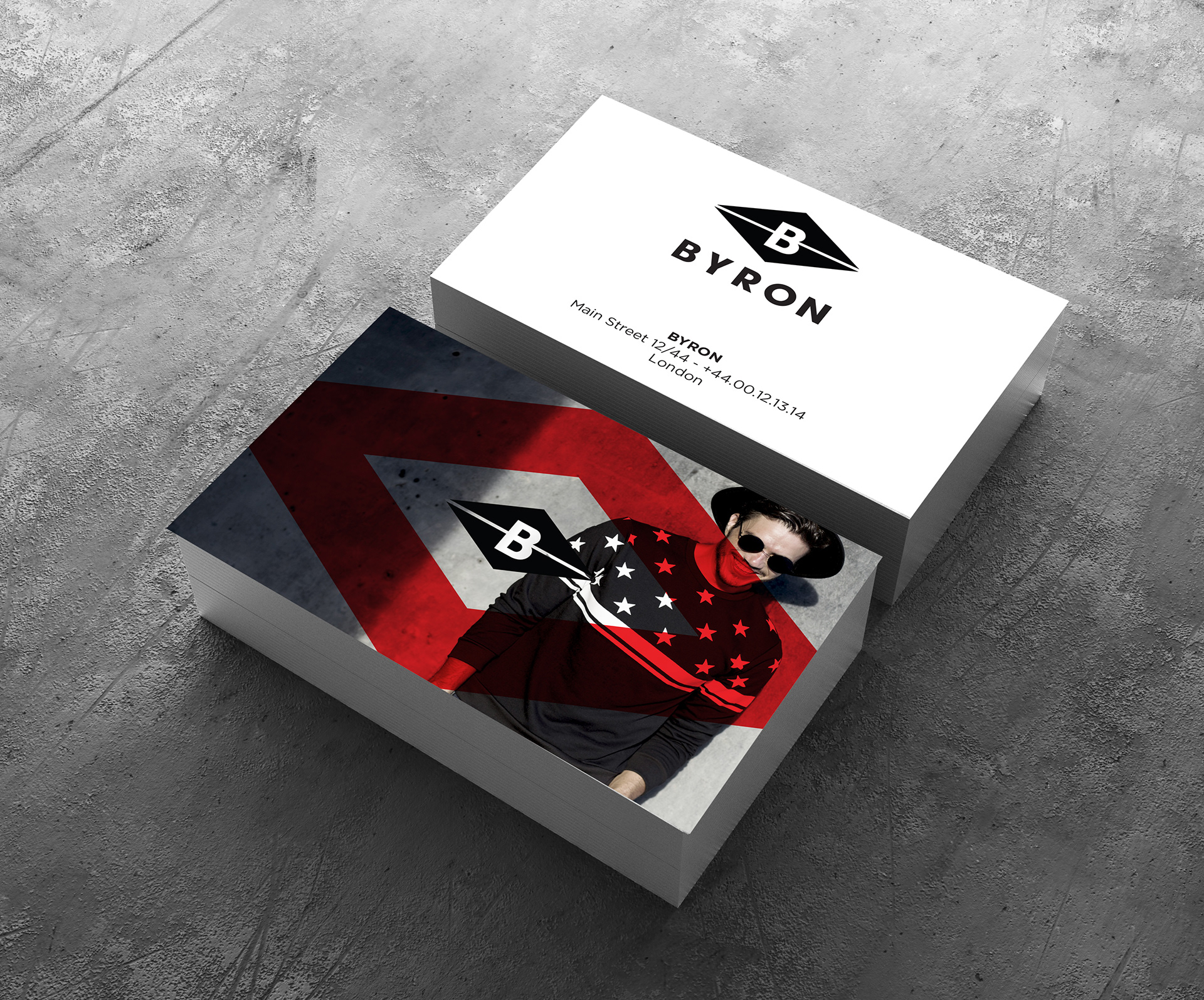
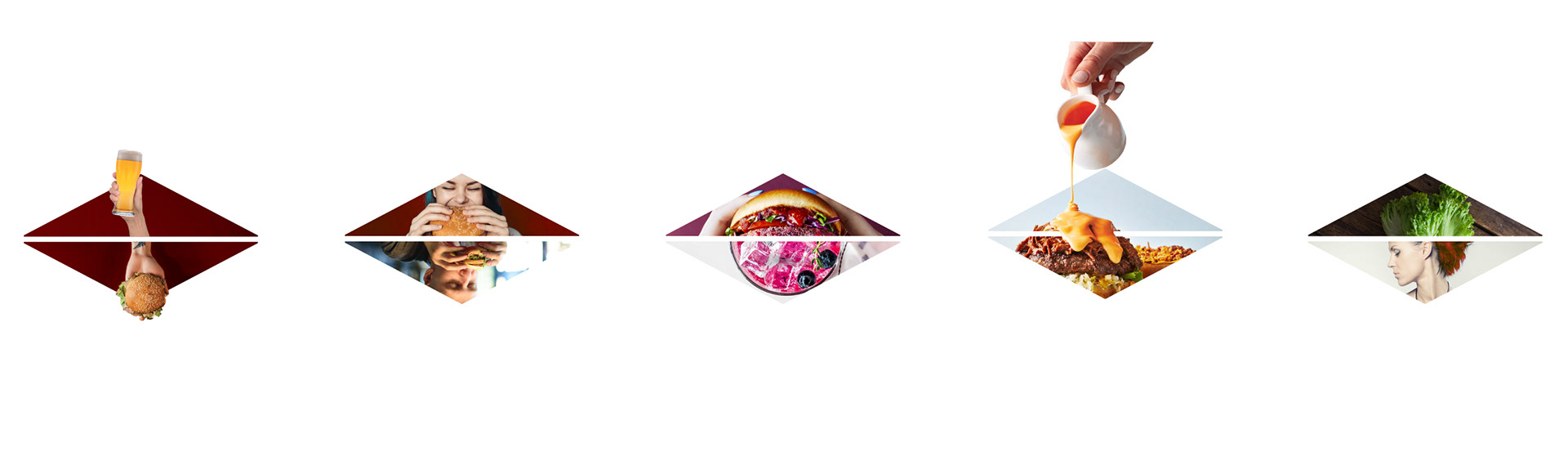
The logo has a dynamic version which should mostly be used for digital communication, video, events and internal communication.
The content of the rhombus can be focused on abstract visuals, patterns or on people or product shots.
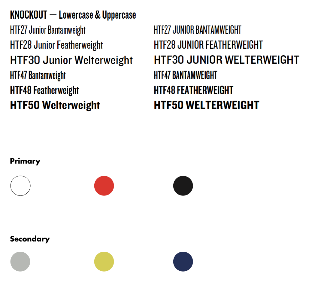
The Knockout, already used in the former Byron identity, it's another connection with its history, a unique sans-serif that contains nine different widths and each width is individually designed to include subtle variations.
4 graphic languages options were considered: the Ultrarhombus, the cropped rhombus, the red rhombus, the light rhombus.